



Module 02 · Themes, UI kits and dark mode
27 GoHighLevel themes, 11 UI kits and a dark mode that holds up
GoHighLevel themes from the customizer restyle every screen at once: sidebar, header, cards, buttons and the blues GoHighLevel hard-codes everywhere. Pick one of 27, swap the UI kit, switch on dark mode and install it once.
One-time payment, lifetime accessLogin within minutes, at most 24 hours
- Midnight Ember
- Arctic Clean
- Ocean Glass
- Forest Finance
- Neon Nights
- Mono Studio
- Sunset Coral
- Royal Navy & Gold
- Lavender Dream
- Slate Corporate
- Aurora
- Desert Sand
- Midnight Sky
- Editorial Studio
- Cinematic City
- Care Desk
- Prism Pro
- Pastel Mesh
- Alpine Glass
- Creative Agency
- Golden Hour
- Deep Space
- Cyber Lime
- Holo Pearl
- Graphite Pro, dark
- Obsidian OLED, dark
- Midnight Mint, dark
Try it live
Try every theme, kit and dark mode on a sample sub-account
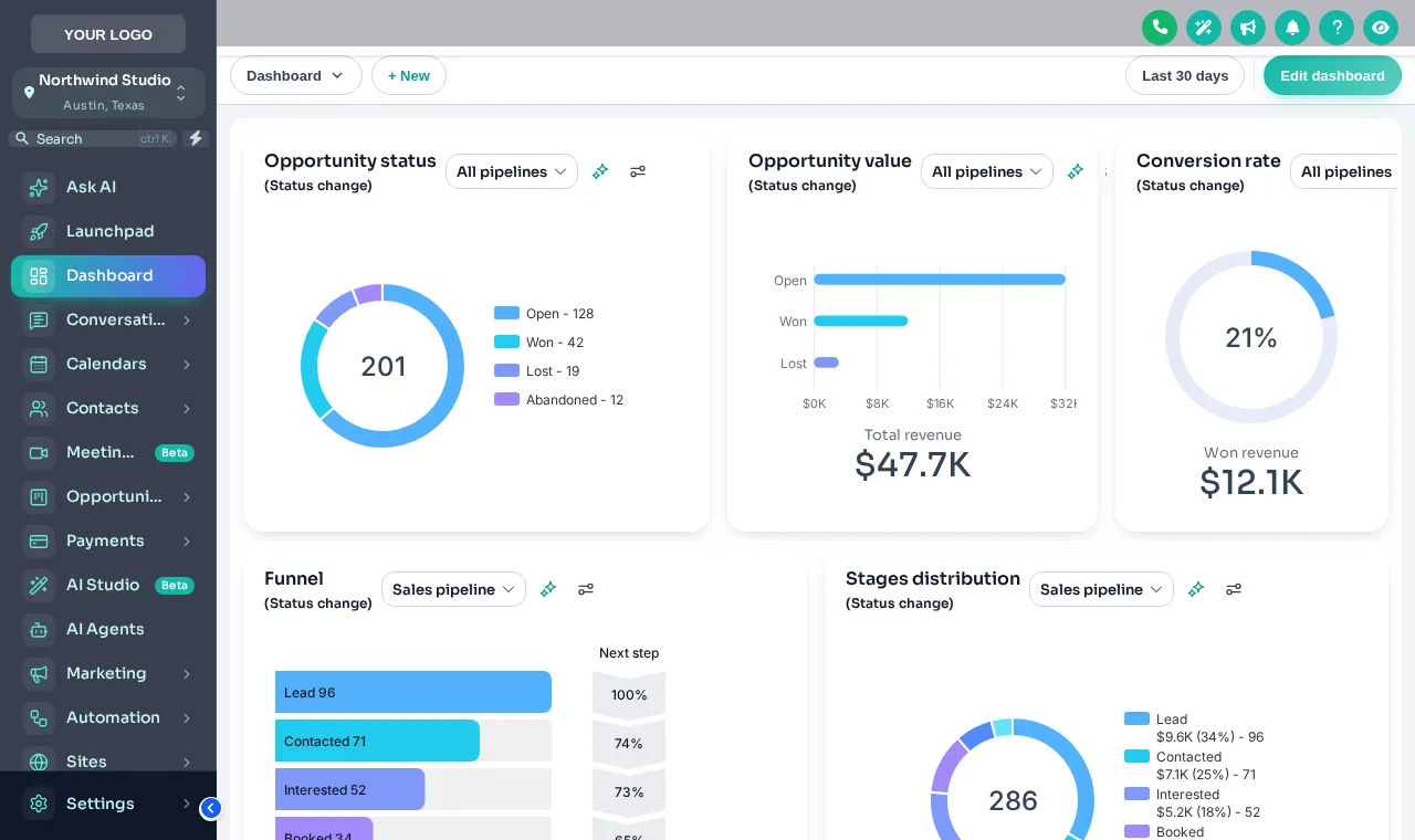
Start from the starting picks or open all 27. Swap the UI kit on top of any theme, switch to dark mode, and flip between the sub-account and agency views. It is the real engine, so what you see is what installs.
Loading the live preview
Aurora The customizer engine is restyling a copy of a GoHighLevel sub-account. Click the menu, collapse the sidebar or open Save contact inside the frame.
What a customizer theme changes in GoHighLevel
White-label settings change a logo and a colour. A theme changes the rest, which is most of what a client actually looks at.
27 complete themes
Each sets the sidebar, header, page background, type, radius, UI kit and a matching login page in one click, as a starting point you can change.
Dark mode
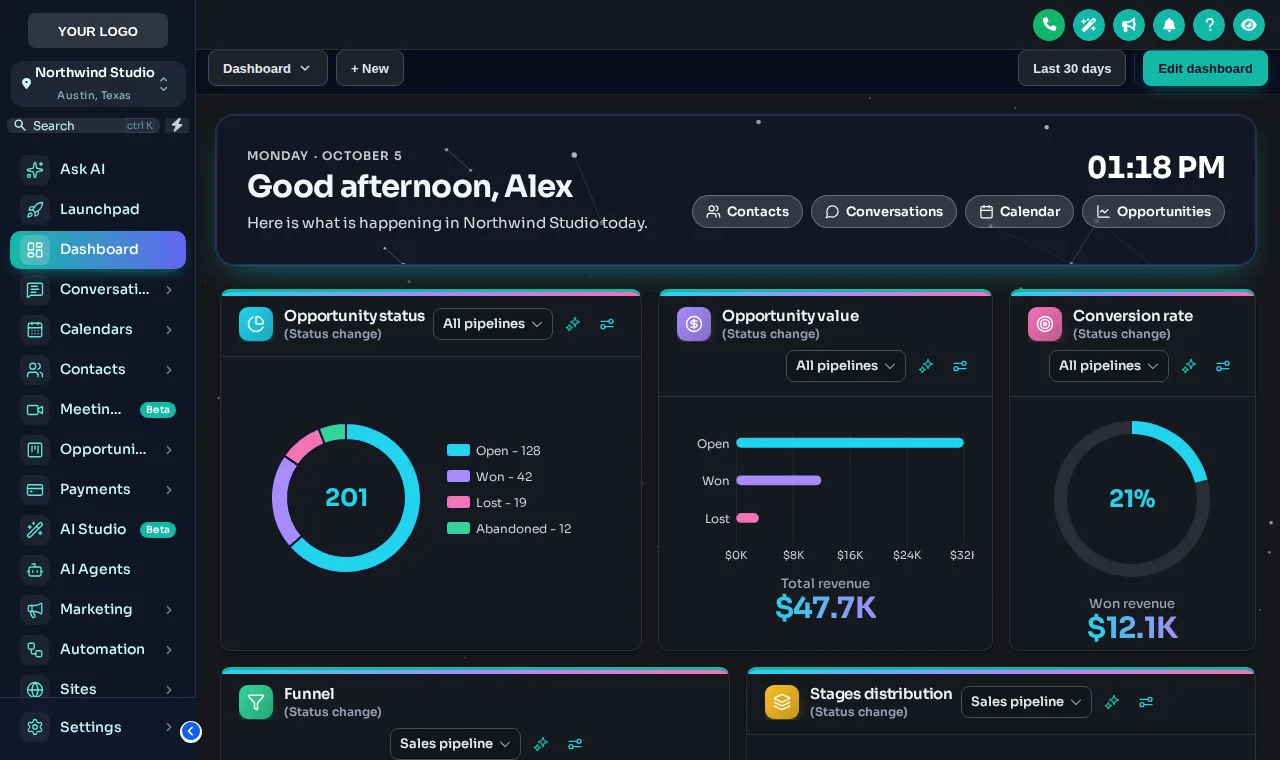
A dark palette for surfaces, borders and text, plus 3 themes designed dark from the start.
11 UI kits
Soft Shadow, Bordered Flat, Elevated, Glass, Accent Top, Side Accent and more: each restyles cards, buttons, inputs, tables, tabs and modals together.
Colour remap
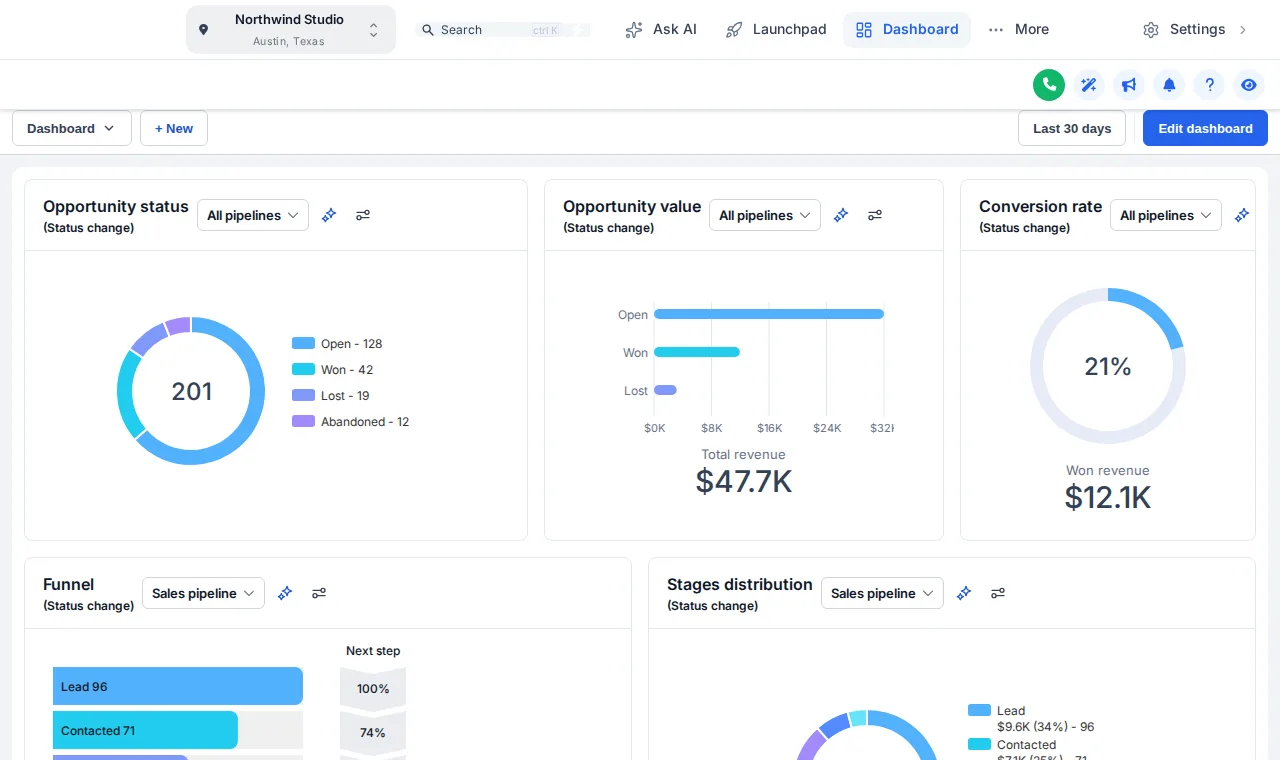
Your brand colour replaces the GoHighLevel blues hard-coded across the app, so nothing stock shows through.
Type, radius and depth
A Google font, how round the corners are and how deep the shadows sit. Small choices that make it feel designed.
Privacy mode
One button blurs names, emails and phone numbers on screen, for demos, screen shares and recordings.
Why a snapshot install still looks unfinished
A snapshot moves pipelines, workflows and funnels into the sub-account. It leaves the GoHighLevel interface exactly as HighLevel ships it, which is the same interface every other agency's clients see.
Stock GoHighLevel
- GoHighLevel blue on every button and link
- A white sidebar with GoHighLevel’s spacing and icons
- Cards and tables in the default style
- No dark option for long days in the app
With the customizer
- Your brand colour everywhere the blue used to be
- A sidebar or top bar in a finished theme with your logo
- Cards and tables in one of 11 UI kits
- Dark mode for the people who want it
In short
GoHighLevel themes, by the numbers
- Themes
- 27, of which 3 are dark
- UI kits
- 11, interchangeable on any theme
- Layouts
- Left sidebar, right dock or top bar
- Applies to
- Agency view and every sub-account
- Package
- Top Starter and up, from $217 one time
Which theme suits which snapshot
There is no right answer, but there are sensible starting points for the industries we sell snapshots for.
- 01
Trades and field service
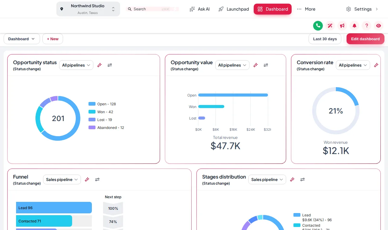
A white top-bar theme such as Arctic Clean keeps menus out of the way on small laptops in the van, with your brand colour carrying the buttons.
The plumbing snapshot - 02
Clinics and practices
A calm light theme with a soft UI kit reads well at a front desk all day. Keep privacy mode handy when sharing a screen with a patient.
The dental snapshot - 03
Law and finance
A dark or graphite theme with a crisp kit signals a premium, serious service, and dark mode suits long sessions.
The law firm snapshot - 04
Creative and marketing agencies
A bolder theme like Creative Agency or Aurora makes the platform part of the pitch when you demo it to prospects.
Browse all snapshots
Which package
All themes, UI kits and dark mode come with Top Starter and every package above it
Themes are the foundation, so every package includes the full set.
- Top Starter $217includes this
- Top Pro $517includes this
- Top Elite $1,047includes this
The process
From theme gallery to live in three steps
Step 1
Pick a theme
Open the theme gallery in the editor and click any of the 27 themes. The live preview restyles a sample GoHighLevel straight away.
Step 2
Make it yours
Add your logo and brand colour, choose a font and corner radius, pick a UI kit and switch dark mode on if you want it.
Step 3
Save
Every sub-account picks up the new look on its next page load, through the line you installed once.
The rest of the customizer
- 01Login page designs16 animated designs for sign-in, two-factor and password reset Top Starter and up
- 02Dashboard designs18 dashboard designs, 6 of them built around a photo Top Pro and up
- 03Sidebar, top bar and menusSidebar, right dock or top bar in 8 styles, 8 mega menu styles Top Starter and up
- 04Popups43 templates in 7 formats, inside GoHighLevel and on websites Top Elite and up
- 05Notifications and social proof94 social proof and widget templates across 32 types Top Elite and up
- 06Pipeline board designs12 opportunities board designs with stage colours by position Top Pro and up
- 07Contact actions barQuick tags and workflow buttons on every contact page Top Pro and up
- 08Floating widgets51 floating contact and chat widget templates Top Elite and up
- 09Calculators134 calculator templates across 14 types Top Elite and up
What is a GoHighLevel theme?
A GoHighLevel theme is a complete visual style for the app: sidebar, header, page background, cards, buttons, inputs, tables, type, corner radius and a matching login page, applied together. The customizer ships 27 of them, and each is a starting point you can change.
How many themes and UI kits are there?
27 themes and 11 UI kits. 3 of the themes are dark by design, and dark mode can also be switched on over the others.
What is the difference between a theme and a UI kit?
A theme sets the whole look, including colours, layout and login. A UI kit only restyles the components inside pages: cards, buttons, inputs, tables, tabs and modals. You can keep a theme and swap its kit, for example a soft-shadow theme with brutalist cards.
Can I use my own brand colour instead of the theme’s?
Yes. Set your brand colour and the colour remap replaces GoHighLevel’s hard-coded blues across the app with it, so no stock blue shows through on buttons, links, toggles or charts.
Does dark mode cover every page?
Dark mode applies a dark palette for surfaces, borders and text across the GoHighLevel screens the customizer styles. Pair it with a dark dashboard design, as in the preview above, so the dashboard widgets match.
Will a theme change my sub-accounts too?
Yes. The theme is delivered by the line installed at agency level, so the agency view and every sub-account load it. Try the Agency and Sub-account views in the preview to see both.
Which package includes themes?
Every package does. Top Starter ($217 one time) includes all 27 themes, all 11 UI kits and dark mode, and the higher packages keep them.
Do themes slow GoHighLevel down?
A theme is CSS delivered with the one script line and cached by the browser, so after the first load it costs very little. The loader bar and logo highlight are short animations that stop on their own.
Finish your GoHighLevel the way you finished the snapshot
One-time payment, lifetime access. Your login is emailed within minutes, at most 24 hours, and you install it with one line of code.